Things tagged map:
The map we need if we want to think about how global living conditions are changing
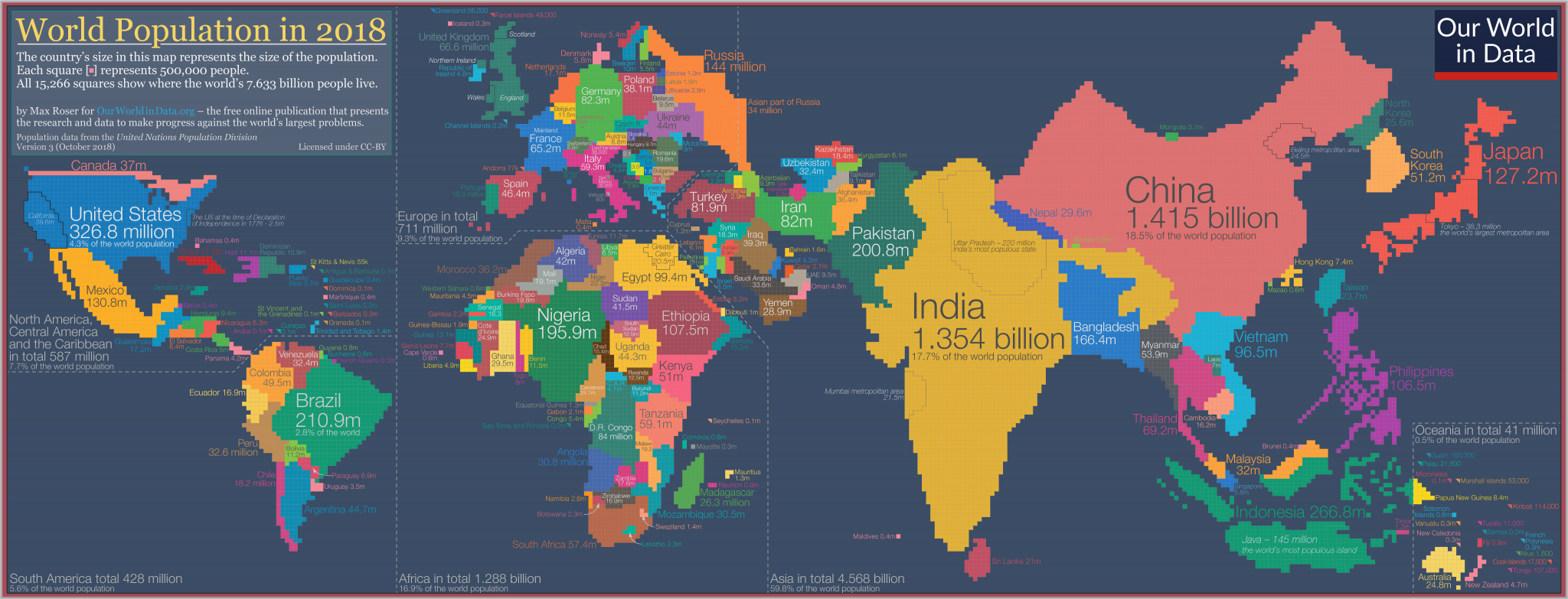
Max Roser at Our World in Data:
To show global data it is convenient to use a map. But despite the popularity and familiarity of world maps, they can mislead our understanding global living conditions.
Maps are made for a different purpose; they show us where the world’s land masses are. They don’t show us where the people are.
If we want to show where the world’s people are we need a population cartogram, a geographical presentation of the world where the size of the countries are not drawn according to the distribution of land, but according to the distribution of people.
So I spent the last few weekends making this cartogram for the world population in 2018.