Things tagged design:
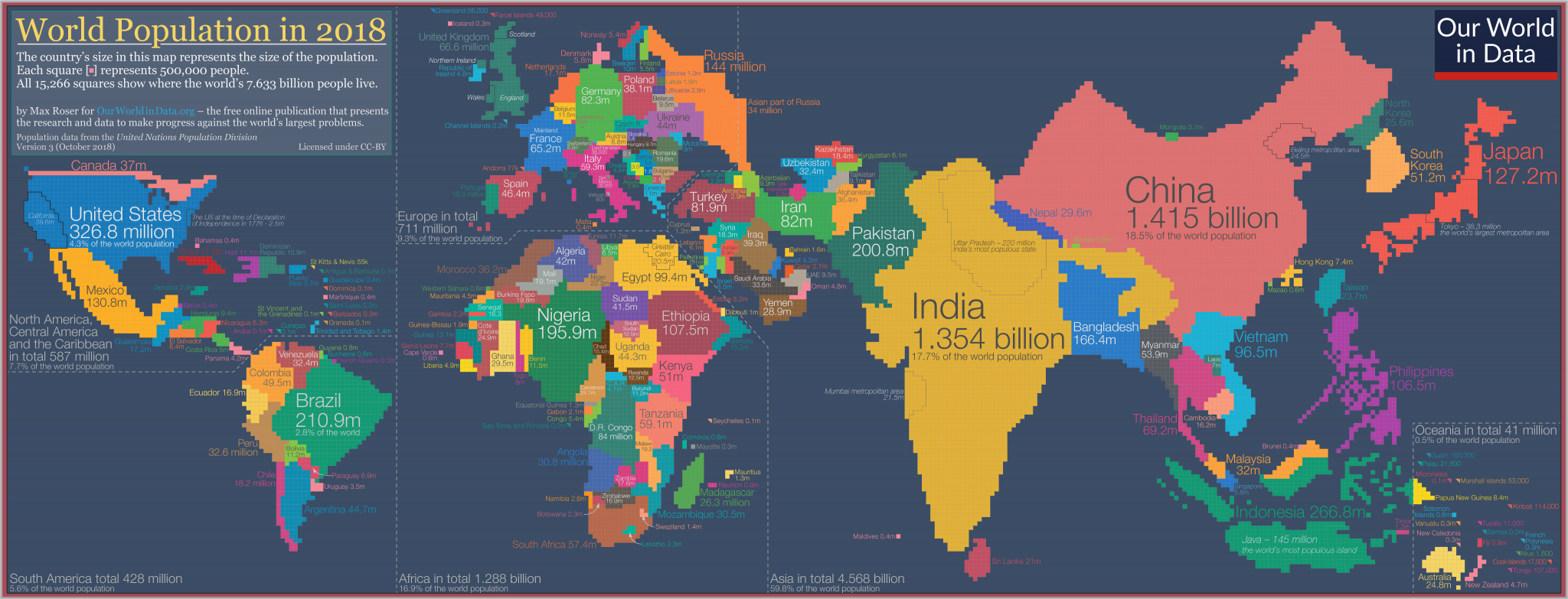
The map we need if we want to think about how global living conditions are changing
Max Roser at Our World in Data:
To show global data it is convenient to use a map. But despite the popularity and familiarity of world maps, they can mislead our understanding global living conditions.
Maps are made for a different purpose; they show us where the world’s land masses are. They don’t show us where the people are.
If we want to show where the world’s people are we need a population cartogram, a geographical presentation of the world where the size of the countries are not drawn according to the distribution of land, but according to the distribution of people.
So I spent the last few weekends making this cartogram for the world population in 2018.
The Future of Cities
A scattershot short docu on youtube by Oscar Boyson, but a decent intro to lots of things I think about:
How 77 Metro Agencies Design the Letter 'M' for Their Transit Logo
Eric Jaffe at CityLab:
Mass transit agencies around the world face the same conundrum: How to make what amounts to four straight lines distinctive.

The Radical Humaneness of Norway’s Halden Prison
Jessica Benko in The New York Times:
To anyone familiar with the American correctional system, Halden seems alien. Its modern, cheerful and well-appointed facilities, the relative freedom of movement it offers, its quiet and peaceful atmosphere — these qualities are so out of sync with the forms of imprisonment found in the United States that you could be forgiven for doubting whether Halden is a prison at all. It is, of course, but it is also something more: the physical expression of an entire national philosophy about the relative merits of punishment and forgiveness.
Stanford’s Most Popular Class Isn’t Computer Science–It’s Something Much More Important
Ainsley Harris in Fast Company:
Before Kanyi Maqubela became an investment partner at the Collaborative Fund, an early-stage venture capital firm focused on social enterprises, he was a typical Stanford student in need of career guidance. He was working with startups, studying philosophy, dating someone special—and feeling overwhelmed.
Enter “Designing Your Life,” a new and wildly popular course for Stanford juniors and seniors that is grounded in design thinking concepts and techniques. The course’s lessons gave him the perspective he needed to navigate decisions about life and work post graduation.
“It really helped me understand what the concept of vocation was,” he says. “I had thought of it either as a narrowly religious concept or for a specific job. But it’s this feeling that I have true agency over my work, because I know what I stand for and I have tools to fix the things that I encounter in my life.”
Death, Redesigned
Jon Mooallem in The California Sunday Magazine:
There’s an ugliness — an inelegance — to death that Paul Bennett gradually came to find unacceptable. It seems to offend him the way a clumsy, counterintuitive kitchen tool might, or a frumpy font. At first, that disgruntlement was just “a whisper in my mind,” Bennett explains. “But it’s gone from being a whisper to a roar.” The solution, when it finally occurred to him, felt obvious. “Oh,” he told himself. “You need to redesign death.”
Britain From Above
Britain looks very different from the skies. From a bird’s eye view of the nation, its workings, cities, landscapes and peoples are revealed and re-discovered in new and extraordinary ways.
Particular nuggets I have found so far include: The Great Migration in the Sky, Taxis in London and Ships Crossing the Channel.
Via 5 Best Data Visualization Projects of the Year at Flowing Data via Beyond the Beyond.
Fleeting Seating: The Slightly Uncomfortable Chair Collection
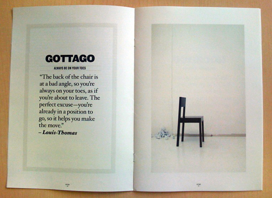
“I remember when I was a kid,” Pelletier explains in the text within the brochure, “there was a rumour – I don’t know if it was true - that at McDonalds, the benches were made so that you wouldn’t spend too much time there.” It was from that thought the idea for the Slightly Uncomfortable Chair Collection (SUCC) came.
Via kottke.org.
Front Inc
An article in the New York Times on facade engineers Front Inc. They are responsible for engineering the facades of The Seattle Public Library, the Toledo Glass Museum, the New Museum of Contemporary Art in New York and the CCTV Building in Beijing amongst others.
Very poorly written article, but interesting subject.
Via Super Colossal.
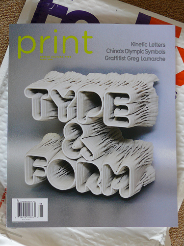
Generation. Man, now that's typography.
Late in April the super friendly people from Print Magazine commissioned me to create a cover design which would conceptually support the main feature article about “kinetic typography” of their special summer issue.
Via Bruce Sterling at Beyond the Beyond.
Christiaan Postma
The starting point with this project was a personal study about form & time. I put together more than 150 individual clockworks and made them work together to become one clock. I show the progress of time by letting the numbers be written in words by the clockworks. Reading clockwise, the time being is visible through a word and readable by the completeness of the word, 12 words from “one” to “twelve”.
Here is an animation of it in action.
Via MAKE: Blog.
The Best House in Paris
Posted by Nicolai Ouroussoff to NYT > Arts.
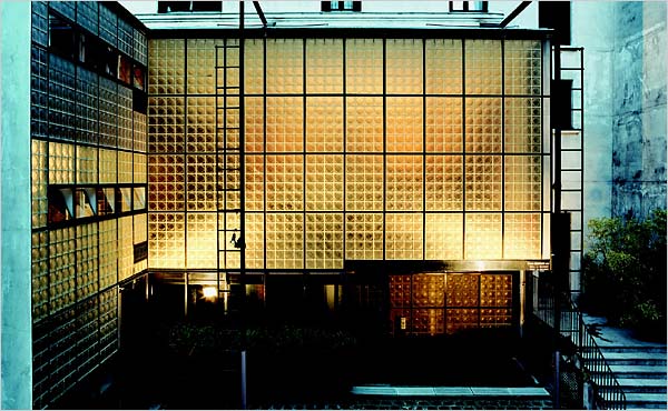
This effect was amplified by the play of light and sound. By turning on and off the various floodlights outside, you could adjust the mood of the entire house. When the lights are dimmed, for example, the house becomes less theatrical, more tender. Voices too travel through the rooms, so that you are always faintly aware of the presence of the other.
It wasn’t until we arose the next morning, however, that we fully understood Chareau’s choreography. The bathroom floor is raised in certain areas so that as we crossed it, we could catch occasional glimpses of each other before suddenly dropping back out of view.
Let There Be Light in Austria's Artificial Sky
When the architects at Skidmore, Owings & Merrill wanted to prove the brilliance of their planned 919-window roof for a new terminal at Singapore's Changi International Airport, they invited officials to Austria for a sneak peek. "It was a hard sell," architect Ross Wimer says of the $1.7 billion plan, "until they stuck their heads inside the building."
The Road to Clarity
Via Daring Fireball.
New York Times Magazine feature by Joshua Yaffa on the typography and design of highway signage, particular regarding Clearview, the new typeface designed to replace Highway Gothic as the standard for signage in the U.S.
pdf-mags
This is mostly just a test to see if I got my publishing toolchain back up and running.
Posted by Warren Ellis to Warrenellis.com.
Jean Snow just sent me this. The few moments in the week that I call my spare time have just been obliterated. pdf-mags.com - an aggregator for PDF magazines.
I am utterly screwed. But isn’t it wonderful? I love that I can now pull down a free magazine stuffed with 56 pages of stencil art from Kiev.
(There’s also a smaller scrnmgs for Flash-driven online magazines.)
Idea2006
Update: Links to all the media available here. Read on for the ones I think are best.
Some interesting talks from Idea2006, ranked in order that I imagine my audience will appreciate them. All the media is here.
Dan Hill: The New Media
Drawing from work in both strategic and operational areas at the BBC in London, I’ll explore some of the ways big media companies are approaching the new media landscape. Far from being marginalised by Web 2.0-style operations, I’ll argue that broadcast media can be reinvented to take advantage of both its traditional strengths and the new environment it finds itself in. I’ll highlight the course we’re plotting between between the top-down, fully-articulated, designed, broadcast models and the fully-participative, emergent, vernacular, open-ended, networked models. Essentially believing there is some value in both, and lots in their potential fusion. This will include examples of strategic work defining the design and navigation principles around the next generation BBC website as well as tactical steps towards this, drawn from interactive products and services made at BBC Radio & Music. This will include using hosting music festivals in Second Life, explorations of ‘Lost’ mapped onto graphical scores, spurious relationships between urban planning and designing media systems and tricks for getting design ‘into the boardroom’.
Mike Migurski and Eric Rodenbeck: Information Visualization, Why Now and Where It's Going
Good talk on Info Viz, audio here, ppt slides with inline movies here (165mb)
pngs of the slides here. Even if you can't play the ppt I recommend you download the zip with the movies, and extract them and figure out which is which as you flip through the pngs, there is some pretty cool stuff in there.
Fernanda Viegas: Information Visualization, Why Now and Where It's Going part 2
Audio, slides. At one point she flips to the live NameVoyager, go play, it's fun.
Paul Gould: Next Generation Libraries
God, what a stuck up prick, but he did have some interesting things to say. Audio, slides.
Linda Stone: Opening Keynote
Designers have a special sensitivity and resonance with mass consciousness. Linda Stone has studied how the way we use our attention impacts and is impacted by mass consciousness. From multi-tasking, to what Stone calls, “continuous partial attention,” to focus and uni-tasking, Stone tracks twenty year social cycles, bringing a sense of context to our current, always-on lifestyle.
And the closing keynote from Bruce Sterling, a little less than I have come to expect from his usually brilliant summations, but still fun: Audio.
I was fairly delirious through the first day due to being awake 48 hours at that point, so if you find anything else good let me know, and I will listen to it, heh.