An Incredibly Detailed Map Shows Europe's Population Shifts From 2001 to 2011
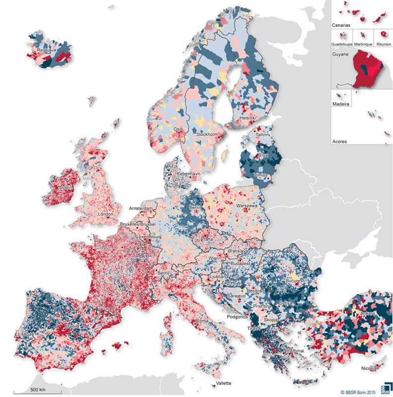
The map works as follows. Dark blue patches show an average annual population fall of 2 percent or more, the medium blue patches a fall of between 1 and 2 percent, and the lightest blue patches a fall of up to 1 percent. Areas in beige have experienced no statistically significant change, while the red areas show population growth. Municipalities in deep red have experienced an average annual population rise of 2 percent or more, the medium red of between 1 and 2 percent, and the pale pink areas of up to 1 percent.